When developers talk about AI-powered design tools, the conversation often splits between full-stack platforms like Lovable or Bolt, and specialized tools that excel at one thing. The v0.dev UI generator falls decisively into the latter category, and that’s exactly what makes it remarkable. Instead of trying to build everything at once, v0 focuses on perfecting individual UI components and delivering production-ready code that developers actually want to use.
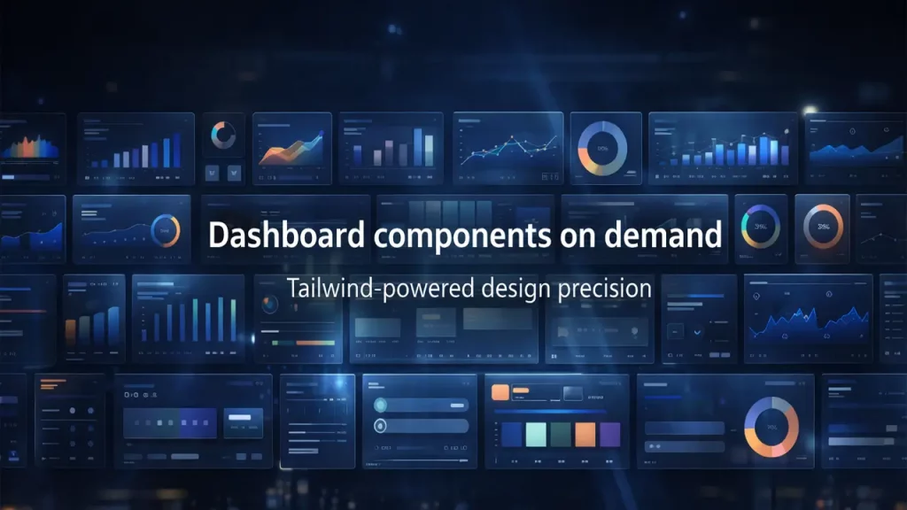
The v0.dev UI generator represents a fundamentally different approach to AI-assisted development. While competitors attempt to generate entire applications from a single prompt, v0 specializes in creating polished, accessible React components that integrate seamlessly into existing projects. This focused strategy has made it the go-to tool for developers working within the Vercel ecosystem, particularly those building with Next.js and modern frontend frameworks.

What Is v0.dev UI Generator and Why Vercel Built It (Vercel v0 UI Components)
The v0.dev UI generator, now accessible at v0.app, is Vercel’s answer to a persistent problem in frontend development: the enormous time investment required to build high-quality UI components from scratch. Vercel v0 UI components are generated through what the company calls “text-to-component” conversion, where natural language descriptions transform into fully functional React code styled with Tailwind CSS and shadcn/ui.
According to Vercel’s official documentation, v0 is described as “an AI-powered development platform that turns ideas into production-ready, full-stack web apps.” The platform uses agentic AI capabilities, meaning it can plan, research, debug, and adapt based on context rather than requiring multiple trial-and-error prompts. This represents a significant evolution from traditional code generation tools that simply output code without understanding the broader development context.
The v0.dev UI generator specifically addresses the “blank canvas” problem that slows down even experienced developers. When building a new feature, developers typically spend hours on boilerplate code, layout decisions, and responsive design considerations before even reaching the unique business logic. Vercel v0 UI components eliminate this initial friction by providing immediately usable starting points that follow modern best practices.
What sets v0 apart is its deep integration with Vercel’s existing ecosystem. The tool doesn’t exist in isolation; it’s designed to work seamlessly with Next.js deployments, Vercel’s serverless functions, and their entire development pipeline. This tight coupling means that code generated by the v0.dev UI generator isn’t just syntactically correct—it’s optimized for the specific performance characteristics and deployment patterns of the Vercel platform.
Component Generation Engine
Core capabilities of our agentic intelligence for modern React development.
| Feature | Description |
|---|---|
| Text-to-Component | Convert complex natural language descriptions into functional, production-ready React components with integrated styling. |
| Agentic Intelligence | Advanced autonomous planning, comprehensive error detection, and iterative logic improvement based on runtime analysis. |
| Web Search Integration | Live access to current documentation, modern UI patterns, and industry best practices during the code generation process. |
| Real-time Preview | Instant visual feedback loop with zero-latency hot reloading as components are generated and refined by the AI. |
Why v0 dev Tailwind CSS Components Prioritize Quality Over Magic
The emphasis on quality in v0 dev Tailwind CSS components becomes evident the moment you examine the generated code. Unlike some AI tools that produce tangled CSS or non-standard implementations, v0 generates clean, maintainable code that experienced developers recognize as professionally written. This isn’t accidental—Vercel has specifically trained v0 on best practices for React, Tailwind CSS, and modern component architecture.
When you request v0 dev Tailwind CSS components, the output follows a predictable, clean structure. The code uses Tailwind’s utility classes appropriately, avoiding the common pitfall of generating inline styles or overly complex class combinations. More importantly, the components respect responsive design principles by default, implementing mobile-first breakpoints and appropriate spacing scales without requiring explicit instructions.
The real advantage of v0 dev Tailwind CSS components lies in their production-readiness. Each component includes proper prop types, handles edge cases like loading and error states, and implements accessibility features such as ARIA labels and keyboard navigation. These details, which developers often skip in rapid prototyping, come built-in with v0 generations.
What makes the code particularly valuable is its maintainability. Because v0 generates components that follow consistent patterns and use standard Tailwind conventions, developers can easily understand and modify the code months after generation. There’s no “magic” happening behind the scenes—just well-structured React components using widely-adopted tools and patterns.
The system also excels at generating responsive layouts without verbose media queries. By leveraging Tailwind’s responsive prefixes (sm:, md:, lg:, xl:), v0 dev Tailwind CSS components automatically adapt to different screen sizes. A three-column grid on desktop gracefully transforms into a single column on mobile, all through Tailwind’s utility classes rather than custom CSS that would be harder to maintain.

v0 shadcn ui generator — Production-Quality UI Without Reinventing the Wheel
The integration between v0 and shadcn/ui represents one of the platform’s most significant advantages. The v0 shadcn ui generator doesn’t just use shadcn/ui components—it deeply understands their architecture and generates code that feels like it was written by shadcn/ui’s creators. This matters because shadcn/ui has become the de facto component system for modern React applications, valued for its accessibility, customizability, and clean design aesthetic.
Unlike traditional component libraries that you install as dependencies, shadcn/ui provides components as source code that you copy directly into your project. This “component distribution system” approach aligns perfectly with v0’s philosophy. When the v0 shadcn ui generator creates a component, you’re not getting a wrapper around some external library—you’re getting actual code that becomes part of your codebase, which you can modify freely.
According to shadcn/ui’s official documentation, every component on ui.shadcn.com can be opened and edited directly in v0. This bidirectional integration means developers can start with shadcn/ui’s curated components and use v0 to customize them through natural language, or begin with a v0 generation that already incorporates shadcn/ui primitives. Either path results in consistent, high-quality code.
The v0 shadcn ui generator excels at combining multiple shadcn/ui primitives into coherent interfaces. For example, requesting “a user profile card with an avatar, bio, and action buttons” produces a component that properly combines shadcn’s Card, Avatar, and Button components with appropriate spacing, alignment, and interaction states. The resulting code doesn’t just work—it looks professionally designed.
One particularly powerful aspect of the v0 shadcn ui generator is its understanding of shadcn/ui’s theming system. Components are generated using CSS variables and Tailwind’s theme configuration, making it straightforward to apply your brand colors and typography across all v0-generated components. This eliminates the tedious work of manually updating color values throughout your codebase when design systems change.
Design System Advantages
Why modern engineering teams choose shadcn/ui for React applications.
| shadcn/ui Advantage | Benefit |
|---|---|
| Source Code Distribution | Components are copied directly into your project, giving you absolute control and zero dependencies on an external package for UI updates. |
| Radix UI Primitives | Built on top of Radix UI to ensure industry-standard accessibility (WAI-ARIA) and robust keyboard navigation are handled automatically. |
| Consistent API | Leverages Tailwind CSS for styling, providing a highly predictable and composable API that developers can master quickly. |
| Theme Variables | Global customization is achieved through CSS custom properties (variables), enabling instant brand-wide updates and easy dark-mode implementation. |
AI UI Component Generator for React — Best Use Cases and Patterns
As an AI UI component generator for React, v0 shines brightest when used for specific, well-defined patterns rather than vague requests. The platform has been trained extensively on common UI patterns—forms, cards, navigation menus, filters, and state management—and generates particularly strong implementations of these standard building blocks.
Form generation showcases v0’s strengths as an AI UI component generator for React. A prompt like “create a multi-step registration form with validation” produces a component that includes proper form state management, client-side validation with helpful error messages, progress indicators, and navigation between steps. The generated code uses React’s useState and useEffect hooks appropriately, follows controlled component patterns, and handles edge cases like validation on blur.
Card-based layouts represent another sweet spot. The AI UI component generator for React excels at creating information-dense card components that display structured data elegantly. Whether you need product cards for an e-commerce site, user profile cards for a social platform, or dashboard metric cards, v0 generates responsive, accessible components with appropriate hover states and interaction feedback.
Navigation patterns—headers, sidebars, breadcrumbs, and mobile menus—benefit enormously from v0’s training on modern UI conventions. The AI UI component generator for React understands responsive navigation patterns, automatically generating hamburger menus for mobile while creating full horizontal navigation for desktop. The code includes proper ARIA labels, keyboard navigation support, and smooth transitions between states.
Filter and search interfaces demonstrate v0’s understanding of interactive patterns. Requesting “a product filter panel with categories, price range, and ratings” generates a component with proper state management, debounced search inputs, and visual feedback for selected filters. The AI UI component generator for React handles the complexity of managing filter state and updating displayed results without requiring extensive debugging.
State management patterns are where v0’s sophistication becomes apparent. The platform generates components with appropriate loading states, error boundaries, empty states, and success confirmations. Rather than simply showing data, v0-generated components handle the full lifecycle of asynchronous operations, providing users with clear feedback throughout the process.
Generate Dashboard UI Tailwind — Crafting Effective Prompts for Complex Layouts
Learning to generate dashboard UI Tailwind components effectively requires understanding how to structure prompts for maximum clarity. Dashboards represent complex layouts that combine multiple data visualization patterns, and v0 performs best when you break down requirements into specific, actionable descriptions rather than vague requests like “make me a dashboard.”
The key to successfully generate dashboard UI Tailwind components lies in describing the grid structure explicitly. A good prompt might be: “Create a dashboard with a 3-column grid—left column for KPI cards, center column for a line chart showing revenue over time, right column for a list of recent transactions. Make it responsive, collapsing to single column on mobile.” This specificity helps v0 understand both the layout architecture and the responsive behavior you expect.
When you generate dashboard UI Tailwind components, including details about data types dramatically improves results. Instead of “show me a chart,” specify “a recharts line chart displaying monthly revenue data with tooltips, a legend, and formatted currency values on the Y-axis.” V0 understands popular React charting libraries like Recharts and can generate properly configured chart components with realistic sample data.
KPI cards—those prominent metric displays at the top of most dashboards—benefit from descriptive prompts. To generate dashboard UI Tailwind components that effectively show key metrics, describe the content structure: “Create four KPI cards showing total users, revenue, conversion rate, and average order value. Each card should display the metric title, the current value with appropriate formatting, a percentage change indicator, and a small sparkline chart.”
Responsive considerations are critical when you generate dashboard UI Tailwind components. Dashboards that look perfect on desktop often become unusable on mobile without careful attention to breakpoints. Include responsive requirements in your prompts: “The grid should show four columns on xl screens, two columns on md screens, and stack to single column on mobile. KPI cards should remain readable at all sizes.”
Dashboard Prompting Framework
Specific instructions for AI agents to generate robust and consistent analytics interfaces.
| Dashboard Element | Effective Prompt Approach |
|---|---|
| KPI Cards | “Generate a metric card component that displays a label (e.g., ‘Total Sales’), a formatted numeric value (e.g., ‘$12,450.00’), a secondary trend indicator (percentage increase/decrease), and a relevant Lucide icon.” |
| Charts | “Create a responsive Chart.js/Recharts implementation. Specify the chart type (Area, Bar, Pie), JSON data structure, axis labels (X: Time, Y: Revenue), and tooltips for hover interactivity.” |
| Data Tables | “Build a tabular view with specific columns (ID, Status, Date, Actions). Include logic for client-side sorting, pagination (items per page), and row action buttons (Edit, Delete).” |
| Grid Layout | “Define a CSS Grid or Tailwind-based container. Specify column spans for different viewports (e.g., 1 column on mobile, 2 on tablet, 4 on desktop) and a standard gap of 24px between widgets.” |
AI Interactive Table Generator — Building Data Tables With Advanced Features
As an AI interactive table generator, v0 handles one of the most challenging aspects of UI development: creating data tables that are both functional and user-friendly. Data tables require managing sorting, filtering, pagination, row selection, and various state indicators—complexity that v0 navigates effectively when prompted with clear requirements.
The AI interactive table generator creates tables that go far beyond simple HTML tables. When you request a data table component, v0 generates a fully-featured implementation using shadcn/ui’s Table components, complete with TypeScript type definitions, state management for sorting and filtering, and proper handling of large datasets through pagination or virtualization.
Sorting functionality is where the AI interactive table generator demonstrates its understanding of user expectations. Generated tables include clickable column headers with visual indicators showing sort direction, proper handling of different data types (strings sort alphabetically, numbers numerically, dates chronologically), and the ability to sort by multiple columns. The implementation uses stable sorting algorithms, ensuring consistent results even with duplicate values.
Filtering capabilities produced by the AI interactive table generator go beyond simple text search. V0 can generate tables with column-specific filters—date range pickers for date columns, dropdown selects for categorical data, and debounced text inputs for string columns. The filtering state is managed cleanly, with visual indicators showing active filters and clear affordances for removing them.
Pagination represents another strength of the AI interactive table generator. Rather than rendering all rows simultaneously (which causes performance issues with large datasets), v0 generates tables with client-side or server-side pagination. The pagination controls include page numbers, next/previous buttons, and options to change page size, all with appropriate loading states during data fetches.
Empty and loading states are where many hand-coded tables fall short, but the AI interactive table generator includes them by default. When no data matches the current filters, users see a helpful empty state message rather than a blank table. During data loading, skeleton loaders or spinners provide visual feedback that the application is working.
Row actions—edit, delete, view details—are implemented thoughtfully. The AI interactive table generator can create action columns with dropdown menus, icon buttons, or inline buttons, depending on your requirements. These actions are properly bound to row data, with confirmation dialogs for destructive operations and proper error handling for failed actions.
v0 dev Design System — Integrating Generations With Your Brand
Aligning the v0 dev design system with your company’s brand identity requires understanding how v0 handles theming and customization. Out of the box, v0 generates components using shadcn/ui’s default theme, but the platform provides several mechanisms for adapting generations to match your specific design requirements.
The v0 dev design system integration begins with Tailwind configuration. By customizing your tailwind.config.js file with your brand colors, typography, and spacing scales, you create a foundation that v0’s generations automatically respect. When v0 generates components using Tailwind classes like bg-primary or text-accent, those classes resolve to your configured brand colors rather than the defaults.
CSS custom properties (variables) provide another powerful mechanism for v0 dev design system integration. Shadcn/ui uses CSS variables extensively for theming, and v0-generated components inherit this approach. By defining variables for colors, radii, and other design tokens in your global CSS, you can apply consistent theming across all v0 generations without modifying individual components.
The Registry system represents v0’s most sophisticated approach to design system integration. A registry is essentially a distribution specification that provides v0 with context about your design system—your custom components, blocks, and design tokens. According to Vercel’s documentation, registries allow v0 to “generate prototypes that match your design system, without manual overrides.”
Creating a custom registry for the v0 dev design system involves setting up a structured repository of your components and design tokens that v0 can reference during generation. Vercel provides a Registry Starter Template built with shadcn/ui as a starting point. This template includes all default shadcn/ui primitives plus example custom components, demonstrating the structure v0 expects.
Component customization within the v0 dev design system follows clear patterns. If you modify shadcn/ui components in your registry—changing button styles, adjusting card layouts, or creating new compound components—v0 can be made aware of these customizations through the registry system. However, Vercel notes that v0 is specifically trained on default shadcn/ui implementations and may struggle with heavily customized versions.
Customization Methods
A technical guide for tailoring generated UI components to project-specific requirements.
| Customization Method | Best For | Complexity |
|---|---|---|
| Tailwind Config | Defining global design tokens such as brand color palettes, typography stacks, and spacing scales. | Low |
| CSS Variables | Implementing dynamic theme switching (Light/Dark mode) and runtime component theming. | Medium |
| Component Registry | Scaling complex design systems with bespoke components and strictly governed UI patterns. | High |
| Post-Generation Editing | Applying one-off visual tweaks or rapid prototyping adjustments directly to the source code. | Low |
Export v0 to Next.js — Seamless Integration Without Surprises
Learning to export v0 to Next.js projects efficiently eliminates one of the biggest friction points in using AI-generated code: the integration step. V0 is specifically designed for Next.js workflows, and the platform provides multiple pathways for moving generated components into your codebase with minimal friction.
The simplest way to export v0 to Next.js is through the “Add to Codebase” button in the v0 interface. This generates a CLI command that you run in your project directory, which automatically installs the component along with any required dependencies. The shadcn CLI handles the installation process, placing the component in the correct directory structure and updating your project configuration if needed.
When you export v0 to Next.js using the CLI approach, the system respects your existing project structure. If you’ve configured component paths in your components.json file, v0-generated components install to those locations. The CLI also handles dependency installation, running package manager commands to add any required libraries like lucide-react for icons or recharts for data visualization.
Manual integration represents an alternative when you export v0 to Next.js. V0 provides a “Copy Code” option that gives you the raw component source. You can paste this directly into your project, though you’ll need to manually handle dependencies and ensure import paths match your project structure. This approach offers more control but requires more manual verification.
Component dependencies are automatically managed when you export v0 to Next.js through the CLI. If a generated component uses shadcn/ui primitives that aren’t yet in your project, the installation command includes them. For example, generating a dialog component automatically installs shadcn’s Dialog primitives if they’re not already present.
Server versus client components represent an important consideration when you export v0 to Next.js. V0 generally generates client components (marked with ‘use client’ directive) since most interactive UI requires client-side JavaScript. However, for static content components, you can request server components explicitly in your prompt, and v0 will adjust the generated code accordingly.
Integration testing after you export v0 to Next.js should verify several aspects: that the component renders correctly, that interactive features work as expected, that responsive layouts adapt properly to different screen sizes, and that the component integrates cleanly with your existing state management or data fetching patterns.

v0 dev Pricing — Understanding Credits, Plans, and Value Proposition
The v0 dev pricing structure has evolved significantly since the platform’s launch, transitioning from message-based billing to a token-based system that provides more predictable costs. According to Vercel’s official announcement in May 2025, this change gives users “more predictable pricing as you grow and increases the amount of usage available on our free tier.”
Under the current v0 dev pricing model, all plans provide monthly credit allowances rather than message limits. The Free plan includes $5 in monthly credits, which is sufficient for exploration and learning the platform. Premium users receive $20 in included credits monthly, while each user on the Team plan gets $30 in monthly credits. This token-based approach means that usage cost varies based on prompt complexity and output length rather than a fixed cost per generation.
The v0 dev pricing tiers serve distinct use cases. The Free plan works well for solo developers experimenting with v0 or building occasional components. However, the $5 credit allocation depletes quickly with regular use, particularly when generating complex components or iterating on designs. Most professional developers will find the Free plan adequate for evaluation but limiting for daily work.
Premium at $20 per month represents v0 dev pricing’s entry point for serious usage. This tier includes $20 in monthly credits, higher file size limits, and access to features like Figma import and API access. Premium is designed for solo developers and freelancers who regularly generate UI components but don’t require team collaboration features. The API access is particularly valuable, allowing integration of v0 generation capabilities into custom workflows or tools.
Team plans at $30 per user per month add v0 dev pricing’s collaboration features: shared credits across team members, centralized billing, and the ability to share chat sessions and projects. This tier suits small development teams where multiple developers regularly use v0 for component generation. The shared credit model means that teams can pool their allowances, with heavy users drawing from a common pool rather than individual limits.
Business plans at $100 per user per month bring privacy and governance features important to larger organizations. This v0 dev pricing tier includes training opt-outs (ensuring your prompts and code aren’t used to train v0’s models), enhanced controls, and improved billing transparency. The Business tier targets companies with data privacy requirements or those needing more oversight of AI tool usage.
Enterprise pricing is customized based on organization size and requirements. The Enterprise tier includes SAML SSO, role-based access control, guaranteed SLAs, and dedicated support. This v0 dev pricing option suits large companies with stringent security and compliance requirements, particularly in regulated industries like finance or healthcare.
Subscription Plans Comparison
Choose the tier that best fits your development cycle and organizational scale.
| Plan | Monthly Cost | Credits | Best For |
|---|---|---|---|
| Free | $0 | $5 / mo | Initial exploration, learning the interface, and personal side projects. |
| Premium | $20 | $20 / mo | Solo developers and freelancers requiring consistent access and higher generation volume. |
| Team | $30/user | $30/user | Small development teams needing shared component registries and collaborative tools. |
| Business | $100/user | Varies | Privacy-conscious organizations requiring dedicated support and advanced security features. |
| Enterprise | Custom | Custom | Large companies and regulated industries requiring on-premise solutions or custom LLM tuning. |
Understanding Token Economics and Credit Consumption
The shift to token-based v0 dev pricing requires understanding how credit consumption works in practice. Tokens represent chunks of text—either input (your prompts and context) or output (the generated code). V0 charges based on both input and output tokens, with rates varying by the AI model used for generation.
Input tokens include not just your prompt text, but also conversation history, uploaded files, and the context v0 maintains about your project. This means that longer conversations or projects with many uploaded reference files consume more credits. V0 automatically includes relevant context to improve generation quality, but this context contributes to token consumption.
Output tokens depend on the complexity and length of the generated code. A simple button component might use relatively few tokens, while a complex dashboard with multiple charts and interactive elements generates significantly more code and thus consumes more credits. Vercel notes that “longer prompts and larger outputs use more tokens, so different actions cost different amounts.”
The token pricing structure under v0 dev pricing uses industry-standard rates based on the underlying AI models. Input tokens typically cost $1.50 to $15 per million tokens, while output tokens have different rates depending on the model selected. These rates align with standard AI model pricing from providers like Anthropic and OpenAI, reflecting the actual compute costs of generation.
Credit management strategies can significantly extend your monthly allowance. Being specific in prompts reduces iteration cycles, saving credits. Breaking large projects into smaller, focused components rather than generating entire pages at once also improves credit efficiency. Monitoring your credit balance regularly helps identify when you’re approaching limits before generations are paused.
Additional credit purchases are available for Premium, Team, and Business plans when monthly allowances are exhausted. These purchased credits have a one-year expiration and can be shared across teams on Team and Enterprise plans. This flexibility ensures that occasional high-usage periods don’t disrupt workflows—you can buy credits as needed rather than upgrading to a higher tier permanently.
Conclusion: Who Benefits Most From v0’s Focused Approach
The v0.dev UI generator represents a deliberately focused tool rather than an all-encompassing solution, and this specialization defines both its strengths and limitations. Developers working within the Vercel ecosystem, particularly those building Next.js applications with Tailwind CSS and shadcn/ui, will find v0 an invaluable accelerator for frontend development. The tool’s deep understanding of these specific technologies produces consistently high-quality results that integrate smoothly into existing projects.
The value proposition of v0 becomes clear when considering the alternative: hand-coding UI components from scratch. Even experienced developers spend considerable time on layout decisions, responsive breakpoints, accessibility features, and interaction states—work that v0 handles automatically. For teams shipping customer-facing features rapidly, v0’s ability to generate production-quality components in minutes rather than hours represents significant time savings.
However, v0’s focused approach means it’s not the right tool for every situation. Projects using Vue, Angular, Svelte, or other frameworks won’t benefit from v0’s React-specific generations. Developers who prefer component libraries other than shadcn/ui will find v0 less valuable, as the platform is specifically optimized for the shadcn/ui component system. Applications requiring extensive backend logic or complex state management patterns will need traditional development approaches for those aspects, using v0 only for UI layer work.
The v0 dev pricing structure makes the tool accessible for exploration while scaling appropriately for professional use. Solo developers can meaningfully use the Free or Premium tiers, while teams benefit from the collaboration features at higher tiers. The token-based pricing model aligns costs with actual usage, avoiding the frustration of hitting arbitrary message limits during critical development periods.
For those evaluating v0, the recommendation is straightforward: if you’re building React applications with Next.js and modern styling tools, v0 likely deserves a place in your workflow. Start with the Free tier to understand the platform’s capabilities and limitations with your specific use cases. The learning curve is minimal—if you can describe a UI in natural language, you can use v0 effectively.
Ultimately, v0 succeeds by not trying to be everything to everyone. It’s a specialized tool for generating React UI components, and it excels at this specific task. Developers who understand this focus and apply v0 appropriately within their development process will find it transforms their frontend productivity, while those expecting a complete application development platform may be disappointed. The tool’s name—v0, version zero—hints at Vercel’s vision: providing that critical first version that developers can then refine and customize for their specific needs.
For more insights on AI-powered development tools and emerging technologies in the frontend space, visit aiinovationhub.com where we continuously explore the latest innovations shaping how developers build for the web.
If v0 helps you ship polished UI components faster, the next bottleneck is usually meetings. That’s where Fireflies AI shines: it records calls, transcribes, summarizes, and pushes key action items into your workflow—so your team spends less time re-watching Zoom and more time building. Check it here: https://aiinnovationhub.shop/fireflies-ai-meeting-assistant-zoom-meet-crm/
Discover more from AI Innovation Hub
Subscribe to get the latest posts sent to your email.